
Home » Portfolios »
Singapore Healthcare General Clinic
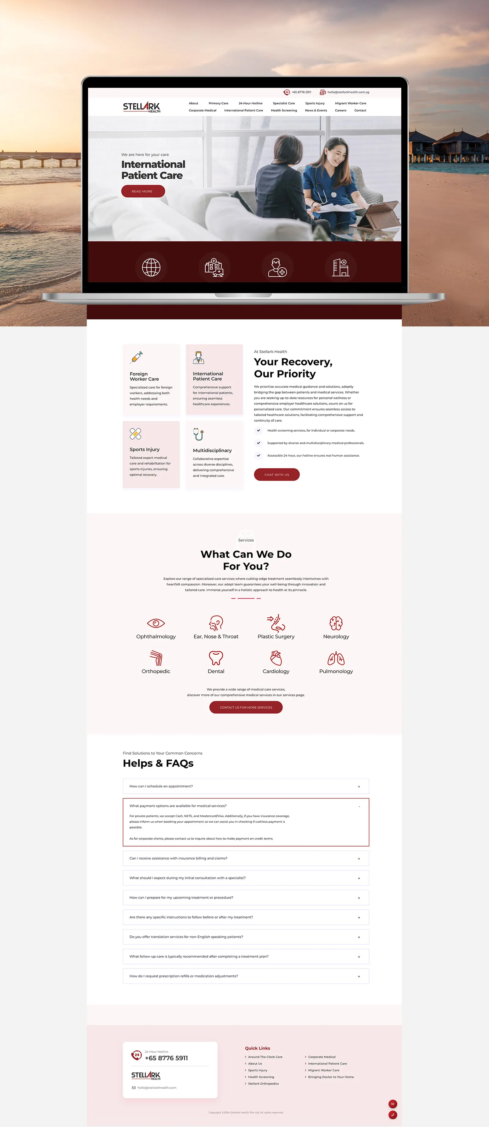
Stellark Health
Stellark Health Pte Ltd collaborated with Passion In Design to transform their digital presence into a patient-first platform. With a focus on trust, accessibility, and clarity, we designed a modern healthcare website that reflects their mission: delivering borderless medical services with compassion and professionalism.

Overview
Crafting a Patient-Centric Digital Experience for Stellark Health
Stellark Health, a Singapore-based healthcare provider, approached us to redefine their online identity. Their vision was clear: build a professional, engaging, and user-friendly platform that communicates their patient-focused care while positioning them as a trusted name in healthcare innovation.
Our scope covered branding, UX/UI design, web development, digital illustrations, and content strategy. As a result, the outcome was a seamless digital presence where patients can explore services, connect instantly, and feel assured by a brand that balances professionalism with empathy.
Services
Information Architecture, User Journey, UX/UI, Web Design, WordPress Web Development, User Experience Design, Performance Optimization, Mobile-Responsive Design
Digital Illustrations
We incorporated educational medical illustrations throughout the website to help patients understand their conditions and treatments.
Icon Set
We carefully curated an icon set that communicates health care services through clear, patient-friendly visuals.
Curate Imagery
We curated imagery that not just healing, but thriving.
One-click WhatsApp
The WhatsApp integration recognizes that medical decisions often involve immediate questions and concerns.
Approach
The Challenge
Building a digital presence that mirrors clinical excellence and instills confidence in patients locally and internationally.
Stellark Health was already a trusted healthcare provider. They offered specialized treatments, health screenings, GP consultations, and even home doctor services. Patients from Singapore, Johor Bahru, Batam, and across Southeast Asia relied on the clinic for accessible, quality healthcare. The challenge was to build a digital presence that reflected this breadth of services while showcasing their patient-first philosophy. The website had to go beyond basic functions. In addition, it needed to tell the full story from routine check-ups to advanced medical care while building credibility for international patients considering medical travel.
The Goal
The goal was to design a digital experience that positioned Stellark Health as a holistic, patient-centric healthcare partner. The website needed to support loyal patients in Singapore while opening doors to new opportunities in the wider region, reinforcing Stellark Health’s role in providing both everyday care and advanced medical expertise.
Professional Presentation Matching Excellence
A digital platform that reflects the same level of professionalism, compassion, and attention to detail that patients experience in the clinic.
Clear Communication for Diverse Audiences
Whether for health screenings, family GP visits, or complex treatments, patients can quickly find the right information and services for their needs.
Enhanced International Reach
Dedicated sections for patients from Singapore, Johor Bahru, Batam, and beyond provide comprehensive information and accessible communication options, building trust in Stellark Health as a reliable healthcare destination.
Streamlined Patient Journey
From booking a screening to arranging a home doctor visit or researching specialized care, every pathway is intuitive, reassuring, and patient-focused.
Visual Identity & Brand Consistency
Color & Illustrations
Strategic Color Palette for Medical Trust and Accessibility
Stellark Health’s palette is built around a sophisticated burgundy red that sets the brand apart from typical healthcare blues, conveying both medical authority and trust. Paired with deep charcoal for readability and compliance, the palette is softened with gentle blush tones to create a calm, welcoming feel. Coral accents add warmth and approachability, while rich wine shades highlight premium healthcare services. Together, these colors balance professionalism with comfort, reassuring patients while strengthening brand recognition.
Our illustrations combined accuracy with clarity. Minimalist visuals explained healthcare concepts, procedures, and service flows in a way that was easy to understand and less intimidating. Consistent use of Stellark Health’s color palette ensures a professional yet approachable look across patient education, service explanations, and digital assets — reinforcing trust while enhancing the overall patient experience.
Educational Medical Illustrations
Stellark Health’s educational medical illustrations were designed to simplify complex healthcare information into clear, approachable visuals that patients could easily understand. Using a clean and minimalist style, the illustrations balanced clinical accuracy with accessibility, reducing anxiety by breaking down procedures, screenings, and treatment processes into digestible steps. Consistently aligned with the brand’s color palette, these visuals supported patient education, enhanced digital storytelling, and reinforced Stellark Health’s identity as a trusted, patient-focused healthcare provider.


We designed clean, minimalist illustrations that balanced medical accuracy with accessibility, breaking down complex procedures into simple steps.
VISUAL COMMUNICATION & ACCESSIBILITY
Clear Symbols, Confident Choices
Medical iconography designed to reduce complexity and support diverse patient needs
We created a bespoke library of medical icons to represent the clinic’s wide range of healthcare services, from general consultations and health screening to home doctor visits and specialist care. Each icon was crafted with minimalist design principles to ensure clarity, scalability and visual consistency across the platform. To improve accessibility, we built a strong visual hierarchy that allows patients of all ages and digital literacy levels to quickly identify the services they need. A color-coding system was also applied to categorize medical specialties intuitively, making navigation simple for both local and international audiences.
Furthermore, we designed the icons as scalable vector graphics that remain sharp across all screen sizes, whether viewed on a mobile phone in Batam, a tablet in Johor Bahru, or a desktop in Singapore. This accessible, patient-friendly iconography not only simplifies complex medical offerings but also strengthens Stellark Health’s overall brand identity. By transforming technical healthcare information into a clear and approachable visual language, the icons play a vital role in building trust, enhancing patient experience, and supporting the clinic’s positioning as a modern, user-focused healthcare provider.


SEAMLESS COMMUNICATION & PATIENT SUPPORT
One-click WhatsApp
Removing barriers to immediate patient communication
We integrated WhatsApp because medical decisions often involve immediate questions. This feature gives patients instant access to clarifications about medical consultations, treatment plans, or appointment scheduling without the friction of traditional contact forms, essential for both local Singapore patients with urgent health concerns and international patients seeking quality healthcare services.
This streamlined approach acknowledges that healthcare communication needs to meet patients where they are. WhatsApp’s familiarity and accessibility across Singapore’s diverse cultural landscape makes it the ideal bridge between Stellark Health Clinic and patients who may be researching healthcare options or need immediate medical guidance from anywhere in the region.
EMOTIVE HEALTHCARE NARRATIVES & WELLNESS INSPIRATION
Visual Storytelling
Health, Happiness & Human Connection
We curated imagery that highlights life beyond treatment, not just healing, but thriving. The visuals capture real-life moments of restored health and vitality, from enjoying everyday routines with family to maintaining active lifestyles. By focusing on positive outcomes and healthy living, the imagery fosters trust and optimism, reassuring visitors that Stellark Health Clinic’s care leads to renewed strength and enhanced quality of life.
The photography strategy deliberately showcases the human connection and compassionate care that defines Stellark Health Clinic, featuring warm interactions between healthcare professionals and patients alongside genuine moments of family joy and wellness achievement.


Showcasing the Ultimate Goal:
Transforming Lives Through Quality Healthcare
Rather than featuring clinical environments, our photography selection emphasizes the emotional and physical wellbeing that successful healthcare treatment provides. From quality family moments to active lifestyle scenes, each image reinforces Stellark Health Clinic’s commitment to helping patients achieve optimal health and vitality.
This aspirational approach shifts focus from illness and uncertainty to wellness and achievement, exactly what patients need when making important healthcare decisions about their future.

MOBILE USER EXPERIENCE
Mobile
Optimizing for patients who research & book on the go
Recognizing that patients often research healthcare information and book appointments on their phones, we optimized Stellark Health Clinic’s website for mobile performance with fast loading and simple navigation. The mobile experience transforms complex medical content into easy-to-scroll formats, making health services accessible at a glance with streamlined booking flows that work seamlessly across all devices.

Worked with Passion In Design for website design and couldn’t be more pleased with the experience. Eunice was absolutely fantastic – her patience and understanding of our requirements made the process smooth and enjoyable. She truly listened to out needs and translated them into a stunning design that exceeded our expectations. Highly recommend!
Jesica Kosasih
Chief Financial Officer, Stellark Health Pte Ltd
We look forward to hearing about your project.

Featured Works