
Home » Portfolios »
Liquor Ice Cream Shop Website Design – Jonker Walk, Melaka
Fuwahh Liquor Ice Cream
Fuwahh Liquor Ice Cream operates on Jonker Walk, Melaka’s busiest tourist street, selling alcohol-infused ice cream. They needed digital and print materials to communicate their product and convert walk-by traffic into customers.

Overview
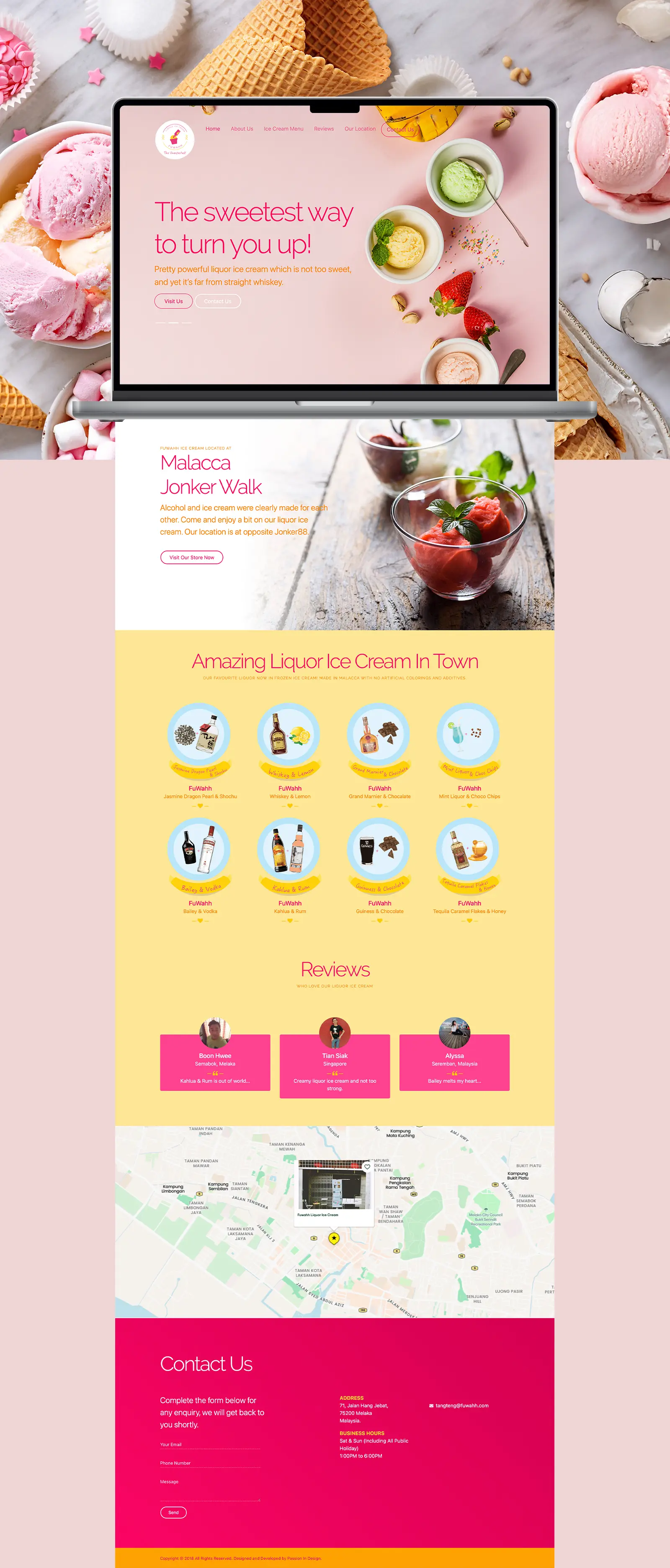
Building a Brand Experience That Turns Heads on Jonker Walk
Fuwahh operates in Jonker Walk’s crowded tourist strip, competing with hundreds of shops for foot traffic. They needed brand identity and marketing materials that could quickly communicate their alcohol-infused ice cream concept to passing tourists.
We created: logo design, business website, printed menu, standing bunting for storefront visibility, and product stickers for paper cups. The visual system uses bright colors and simple graphics to signal the product category at a glance.
Services
Brand Strategy, Visual Identity, Logo Design, Web Design, Web Development, UX/UI, Marketing Collaterals, Social Media Branding
Reviews Section
Social proof for first-time visitors.
Jonker Walk Location Section
Product Grid
Visual pairing shows bottle + ingredient.
Hero Slider
Rotating messages target different decision triggers.
Circular Logo Badge
Scalable shape and format works from storefront to cup stickers

Approach
The Challenge
Capturing tourist attention in a 3-second window on Malaysia's heritage street in Melaka.
Enhanced Lead Generation
There are hundreds of shops on Jonker Walk for tourist foot traffic. Most visitors are unfamiliar with liquor-infused ice cream and walk past without stopping. The business needed brand touchpoints, website, menu, visual, packaging, that could communicate their unique product concept instantly and convert curiosity into purchases.
We created a visual system with high-contrast colors and layout that registers at a glance, helping tourists identify the shop and understand the product offering before they’ve even stopped walking.
DIGITAL STRATEGY
Design & UX
Creating recognition in a high-traffic tourist environment
Visual Identity & Branding
The Fuwahh logo uses a circular badge with “LIQUOR ICE CREAM” arched at the top and the brand name at the bottom, framing a central melting popsicle graphic. The icon immediately communicates the product category at a glance.
We selected pink and yellow for maximum visibility in Jonker Walk’s dense retail environment, these colors create high contrast against typical wood and brick shopfronts, making the brand identifiable from distance. The circular badge format scales effectively: readable on storefront signage at 20+ meters, legible on A5 menus at arm’s length, and recognizable as a small sticker on paper cups.
Logo & Brand Expression
The badge structure contains all necessary information (product category + brand name) in a format that doesn’t require linear reading. Tourists scanning the street can identify “liquor ice cream” before processing the brand name, reducing decision friction for walk-by traffic.

Building Visual Recognition
Concept to Visual Impact
Digital Presence for High-Traffic Tourist Environment
Fuwahh’s website needed to work as a digital storefront for tourists researching Jonker Walk destinations and as a navigation tool for walk-by visitors searching for directions. The design prioritizes instant product recognition, visual communication over text, and location accessibility.
Color & Brand Visibility
We selected pink and yellow for maximum visibility in Jonker Walk’s dense retail environment. These colors create high contrast against typical wood and brick shopfronts, making the brand identifiable from distance in pedestrian traffic.
Hero Slider Strategy
Three rotating slides present different angles of the liquor ice cream concept using the same product photography:
- “The sweetest way to turn you up!”
Establishes the alcohol-dessert combination - “The unexpected! We are introducing 8 Recipes”
Communicates variety - “The cutest way to ‘drink’ a Whiskey!”
Gives concrete flavor example
Each message targets a different decision point: unfamiliarity with the product category, concern about limited options, curiosity about specific pairings.


Product Menu Presentation
Product section on yellow background displays eight circular thumbnails pairing alcohol bottles with ingredients (chocolate, lemon, honey, mint). Each thumbnail shows the bottle alongside the complementary ingredient illustration.
The visual pairing format communicates the concept without text explanation, tourists unfamiliar with liquor ice cream can understand the product immediately through the graphics. Yellow background creates visual separation from pink hero and white content sections, drawing attention to the product offerings.
Location Integration
On the website, Jonker Walk location section features ice cream photography with text callout and landmark reference (“opposite Jonker88”). CTA button links directly to embedded Maps.
Map integration shows storefront location with photo marker popup displaying the actual shopfront. Tourists tap once to open device navigation from their current location, eliminating the need for text directions or address searches.


Print & Physical Collaterals
Extending Brand Presence Beyond Digital
Print materials create consistent touchpoints from storefront visibility to in-hand customer interactions, reinforcing brand recognition across the full customer journey on Jonker Walk.
Ice Cream Cup Stickers
Circular logo stickers applied to paper cups. The badge format remains legible at small scale on curved cup surfaces. Functions as mobile brand exposure, customers carrying cups through Jonker Walk create visibility for the business among pedestrian traffic.

A4 Menu
The A4 menu lists liquor-ice cream pairings with pricing. Format provides clear product reference at counter for customer ordering. Pink and yellow brand colors maintain visual consistency with website and storefront materials.


Like a gem
Eunice is my closest product packaging designer I can find with swift response.
To find someone with such talent in Melaka is like a gem. Keep up your good work. This is a honest review and not a scam. 🙂
Tang Teng Foo
Fuwahh Liquor Ice Cream
Let’s start your own transformation journey.
Featured Works